What Exactly is Design?
The Appeal of Retro: But Why?
Graphic design involves creating visually compelling materials like illustrations, business and press works, publishing, music covers, movie posters, packaging, advertising, web design, and signage. It’s a vital tool in visual communication across new media, used for marketing, advertising, and enriching art culture. The aim is to engage a specific audience, informing them about events, artists, or venues in a format tailored for print or digital media. A graphic designer acts as a bridge between a client and their intended audience, transforming instructions into visual content for a defined group. This content spans across both print (posters, flyers, covers, magazines) and digital realms (web design, websites, banners, social media, and TV spots). The history of graphic design is as old as humanity itself, tracing back to the prehistoric cave drawings of Lascaux, through the works of legendary artists like Leonardo da Vinci, Pablo Picasso, and Vincent Van Gogh, and evolving to today’s street art in cities like Rio, New York, and Tokyo. The advent of artificial intelligence and revolutionary graphic tools like Midjourney, Dall-E, Stable Diffusion, and many others, might be disorienting for some graphic artists, especially if people use these AIs with their own styles. However, this presents an opportunity to create even faster and with a significantly higher quality for the pleasure of our amazed eyes.
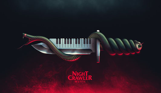
Retro iconography, encapsulating terms like ‘Kitsch’, ‘Old School’, or ‘Vintage‘, represents a style that harks back to the trends of the 1980s or earlier, reviving past cultural currents. This concept is prevalent in various fields including advertising, media, cinema, and art, but it’s particularly significant in the world of Synthwave music. In today’s digital landscape, this retro revival serves as a nostalgic nod to the past, while simultaneously offering a unique, contemporary twist. It allows creators to blend historical aesthetics with modern sensibilities, creating a timeless appeal that resonates with a broad audience, bridging generational gaps with its universal charm.
The World Design Retro
Design, as a field, boasts a myriad of styles that span across different eras, but it’s the 1980s science fiction-inspired aesthetic that holds a special place on our website. This particular style is closely intertwined with the Synthwave musical universe. Designers often draw inspiration from old-school movie posters, music album covers, computer and video game graphics, horror films, and vibrant TV series from that era. By projecting back more than 40 years yet employing modern technology, they achieve a result that’s not only visually appealing but also resonates with both nostalgia and contemporary tastes.
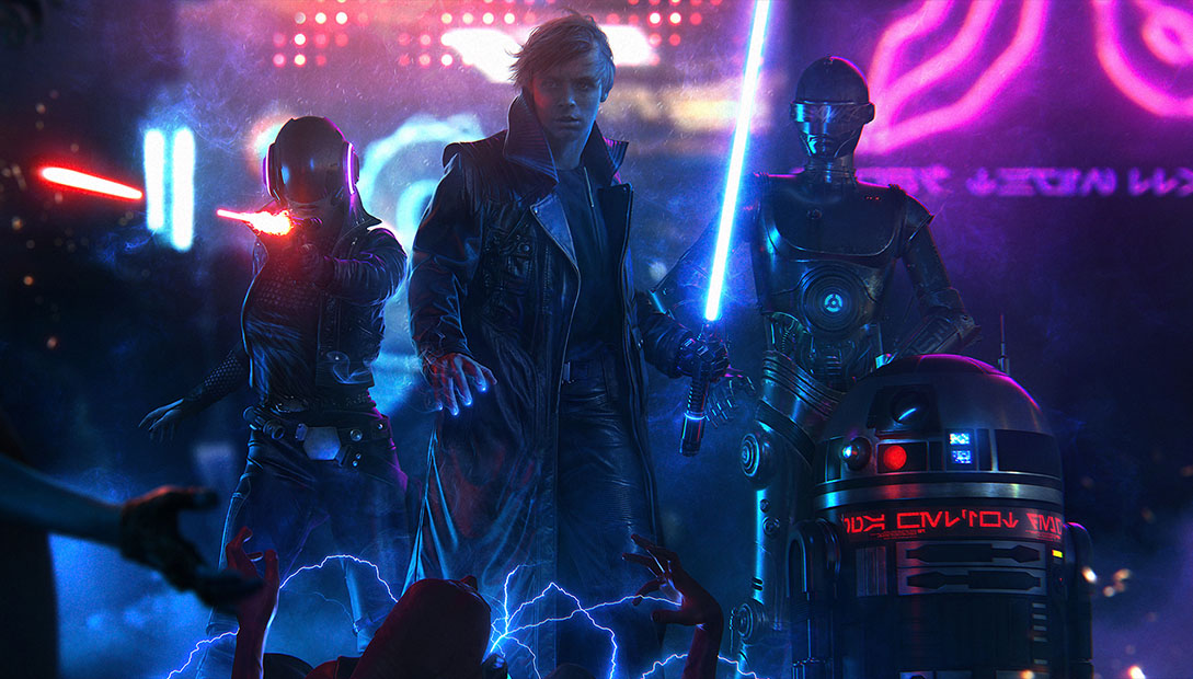
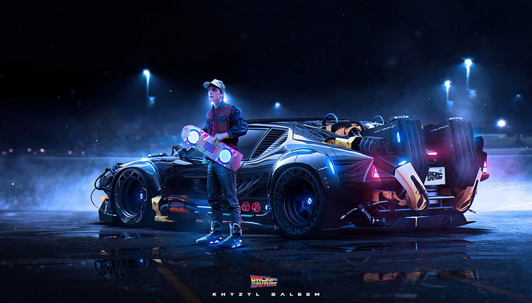
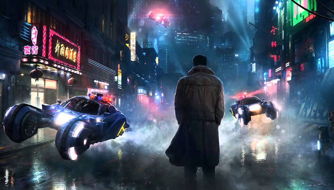
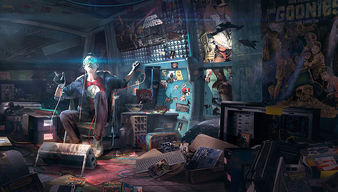
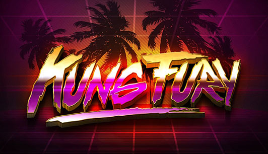
Among the masters of this style is Drew Struzan, a painter whose career began in the 1970s and continues to this day. Struzan, known for his iconic Star Wars, E.T., The Thing, Blade Runner, Back to the Future, Indiana Jones, The Goonies, and Super 8 posters, has influenced countless artists. This includes Paul Shipper, an illustrator for major studios like Marvel, Lucasfilm, Warner Bros, and Disney, and Andreas Bennwik of Laser Unicorns studio, who created the stunning poster for David Sandberg’s ‘Kung Fury.’ The Zonders, a German collective founded by Wolfgang 3000 and Dieter Dunkel, are responsible for the vibrant visuals of the Valerie collective, led by Synthwave musician College. Additionally, Canadian illustrator James White of Signalnoise and German 3D animator Florian Renner stand out with their unique styles. Their work, embodying the essence of the Synthwave universe, is highly sought after in the Retrowave artist community for adhering to the genre’s distinct aesthetics.
How to recognize Retro Design genres
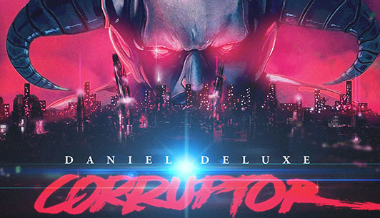
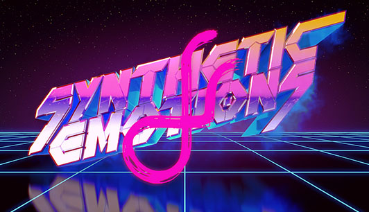
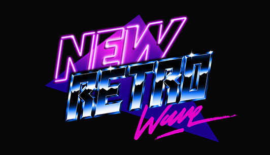
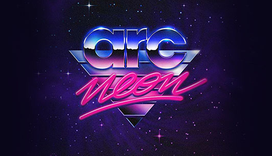
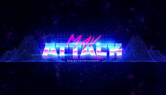
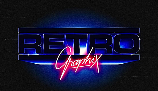
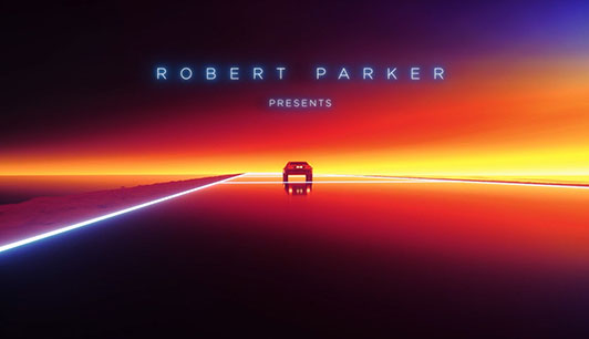
Retro-Futuristic Logos
Priority
– Emphasize dark, dominant colors like black, purple, pink, and blue.
– Use a primary logo featuring 3D thick-stick typography, boasting a chrome metallic texture reflecting mountains.
– Implement a secondary logo with handwritten typography in laser or neon colors.
– Incorporate mountain graphics either as gradient fills or 3D wireframes in the background.
– Create a backdrop of a dark, star-filled sky.
Alternative
– Feature a chrome robot or humanoid in 3D wireframe.
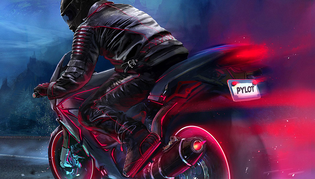
– Include a futuristic sports car, depicted at high speeds.
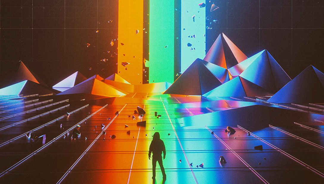
– Utilize triangular motifs.
– Incorporate imagery of a spaceship.
Influences
– Draw inspiration from the aesthetic of ‘TRON’.
– Channel the vibe of ‘War Games’.
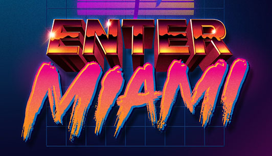
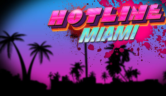
Miami Touch
Priority
– Focus on clear, dominant colors like sky blue, pink, orange, and yellow.
– Design the primary logo with thick stick typography in a solid color.
– Create a secondary logo featuring handwritten typography in a flashy color.
– Use a sun motif with an orange and yellow gradient, occasionally incorporating horizontal cuts.
– Set the scene with either a clear, sunny sky or a sunset.
– Add coconut trees alongside a road for a tropical feel.
Alternative
– Depict an 80s sports car racing at high speeds.
– Feature a pin-up character dressed in 80s fashion.
Influences
– Draw inspiration from the style of ‘Miami Vice’.
– Embrace the vibe of ‘The Beverly Hills Cop’.
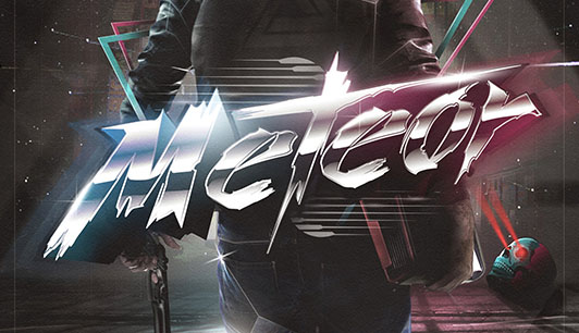
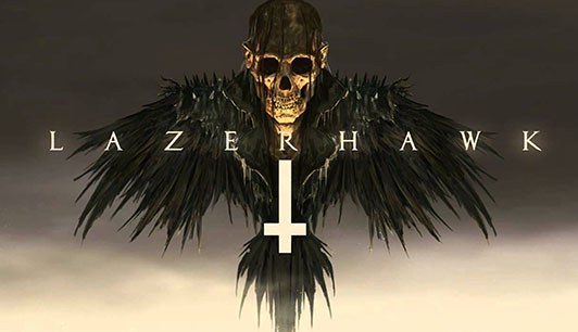
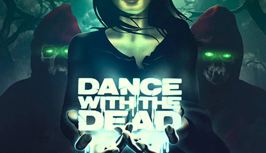
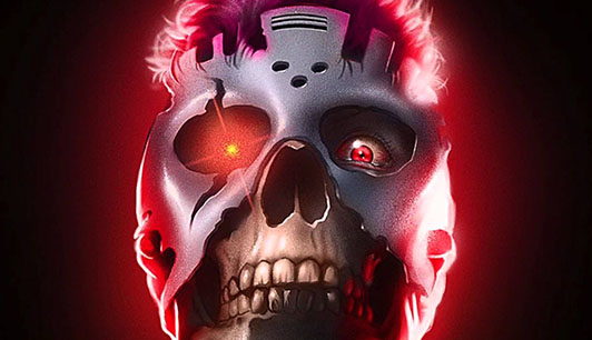
Horror
Priority
– Embrace dark dominant colors such as black, red, and blue.
– Develop a primary logo featuring handwritten typography or a painting effect, using aggressive colors.
– Craft a secondary logo also with handwritten typography in bold, aggressive colors.
– Include illustrations themed around horror elements like monsters, zombies, and skeletons.
Alternative
– Introduce artwork featuring a sexy woman styled as a vampire or in retro-futuristic attire.
– Use symbols associated with the dark side, like an upside-down cross or an inverted star.
Influences
– Take cues from the eerie ambiance of ‘Halloween’.
– Incorporate elements reminiscent of ‘Hellraiser’.
– Draw inspiration from the futuristic, dystopian feel of ‘Terminator’.
– Channel the sci-fi horror essence of ‘Alien’.