It is with great pride that we present our first interview dedicated to the finest graphic designers in the Synthwave music visual universe. Chromed logos, laser wire mountains, vibrant lights, and all elements characteristic of this style are second nature to the unrivaled master in this field, James White, founder of Signalnoise Studio. We’re privileged to feature insights from this extraordinary Canadian artist, known for his work with major companies like Ubisoft, MTV, Adobe, Nike, and bands such as GUNSHIP, Power Glove, and NRW Records. As an expert in Photoshop and Illustrator, he reveals his beginnings, influences, secrets, and much more. This interview is rich, intriguing, and enthralling, increasing our admiration for this king of retro-futuristic design, the man who inspired the visual aspect of Retro Synthwave.
Space Master: James, first congrats for your work being better and better every time you do something. We have been following you for a long time now. Can you introduce yourself to our readers who more or less know you?
James White: I’ve been drawing since the age of 4, drawing on every scrap of white paper I could find in the house. I was born in 1977 so I really grew up in the 80s and consumed all the cartoon, movie and toy culture of the time so that all seeped into what I wanted to draw when I was a kid. I won colouring contests and poster contests in elementary school, and continued drawing all the way through junior high and high school. On Friday nights while other kids were running around causing trouble or getting drunk, me and my buddy Mike would go to the comic shop then back to his place to draw, watch horror movies and play video games. It’s who we were, and despite it not being the most popular thing you could do in high school, I wouldn’t trade that time for the world.

You say that you are drawing since you’re 4 years old. Then you trained on two legendary softwares. How did you get there?
After getting out of high school in 1995 I enrolled in a graphic design course at a community college in my hometown. It was a bare-bones 1-year course which taught me the basics of typography, logo design, and the introduction to Adobe Photoshop and Illustrator. Up until that point I only had access to my family’s Commodore 128, so using a Mac with Photoshop opened up an entirely new world of creating. Definitely a step up from my coloured pencils. I immersed myself in the technology, figuring out ways to add digital colour and effects to my drawings with moderate success. After graduating I enrolled in a 2-year course called Interactive Technology in 1997, which taught me CD ROM design, website design, Flash animation, plus things like video production, sound recording etc. Despite most of my projects being mediocre, they all allowed me to use Photoshop and Illustrator to amp up the quality of the final product… which in turn got me good grades. I was a bit of an artistic con man. Following school in 1998 I was hired into the website industry where I worked for 10 years but always working on my own art during evenings and weekends. Honing my skills and building personal projects, large and small.
While you were employed in various agencies, how and why did you create your own Studio named Signalnoise? What did it bring to you?
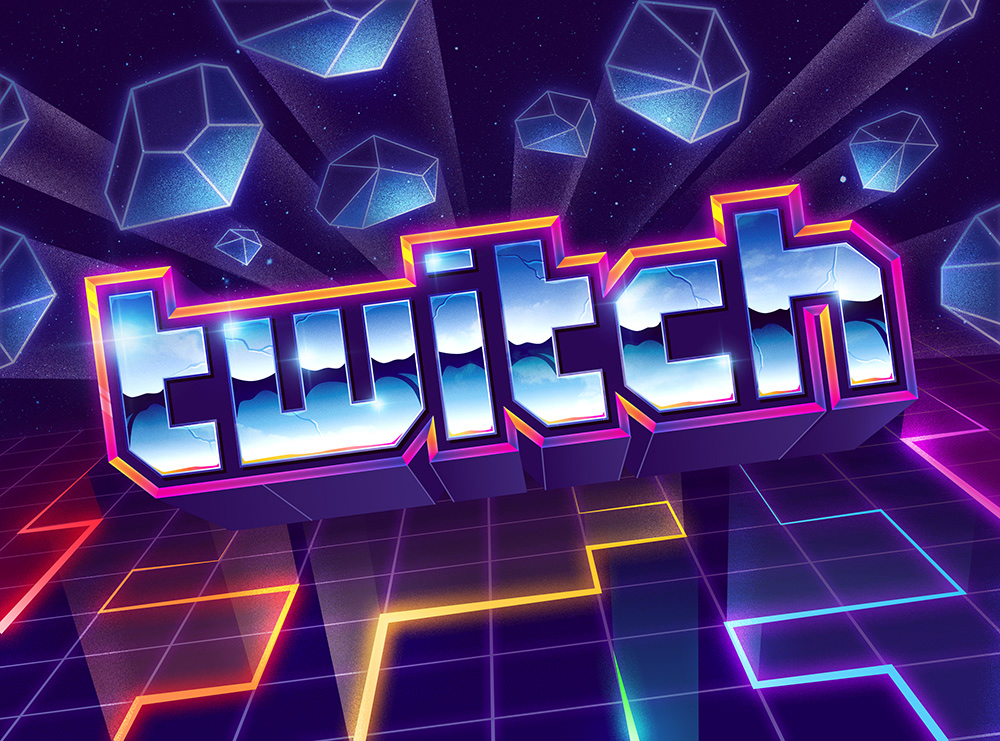
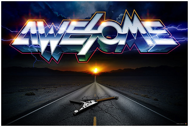
I registered signalnoise.com in 1999 as a place where I could post my art and various projects. My own little corner of the internet. I had too many ideas in those early days so the site was never actually launched, not to the extent I wanted anyway. I spent about 8 years floundering about, not really sure what I wanted it to be, all the while working on an array of projects for my own enjoyment. Signalnoise finally came together in 2007 when I switched to a blog format, to post and discuss my artwork. The blog, along with Flickr at the time, helped me develop an audience which urged me to produce more and more work. I got caught up in certain styles and the momentum grew quickly after I started experimenting with styles from my childhood, the 80s. Nobody was exploring that era at the time, so when my art emerged it immediately got attention with the wild colours and chrome text. That’s when I was able to quit my job at an agency and pursue Signalnoise full time.
« (…) I started experimenting with styles from my childhood, the 80s. Nobody was exploring that era at the time, so when my art emerged it immediately got attention with the wild colours and chrome text. »

We all know that creating ourselves a visual identity is extremely difficult in this graphic world, but your retro-futuristic style is clearly recognizable. What advice do you have to any designers who struggle achieving that?
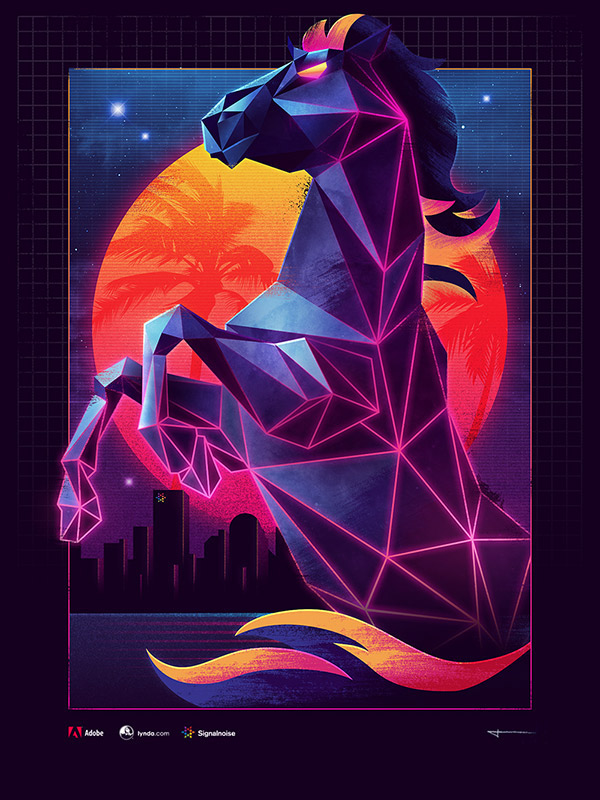
My story happened quite by chance through being relentless with my artwork. I was always creating something, and released multiple pieces of art each week in order to build my online presence. Being unique within the retro-future scene I believe comes from recognizability, I use similar palettes and effects in my work so it’s become familiar to those watching what I do. But the biggest part of being unique within a scene is to constantly push yourself to try new stuff. It would be very easy for me to use a grid floor, wireframe mountains and a big pink sun in my work (which I have in the past), but that’s not bringing anything new to the stage. Especially now since it seems the synthwave scene is flooded with those motifs. I much prefer to try new things that have the same atmosphere at my body of work. How far can I push it? I mean, my advice to artists is to always be working on something… that’s the only way to get better. Keep creating.
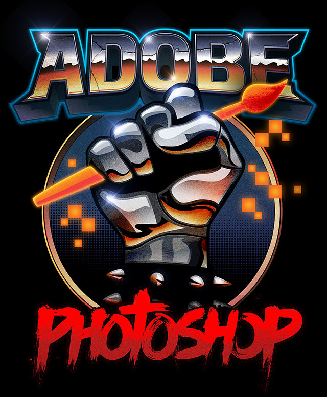
You are independent but you have been courted by Adobe, MTV, Universal Music, Nike, Toyota, Red Bull and especially Ubisoft for the which you provided incredible artworks. How did this happen?
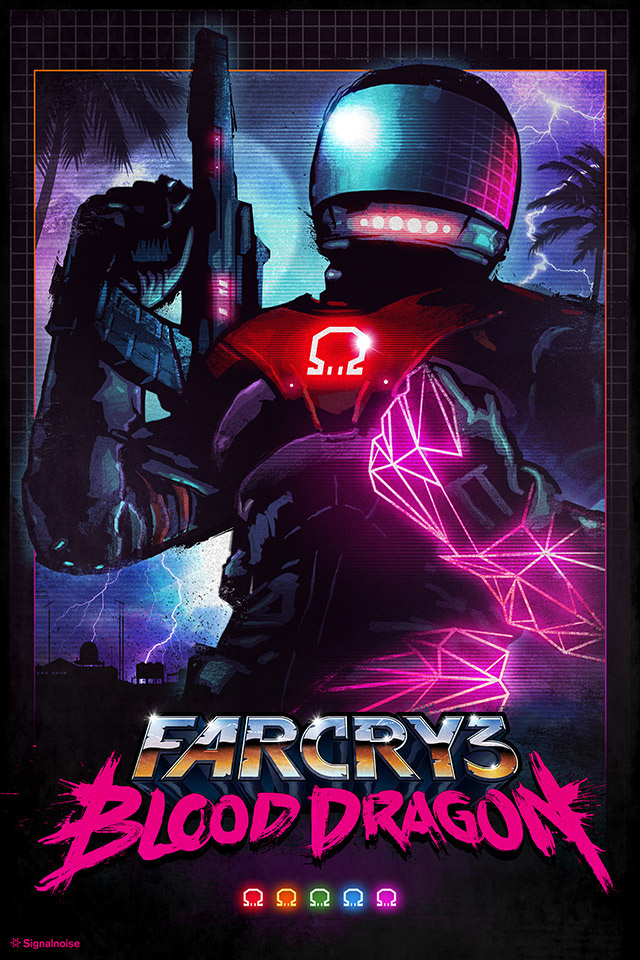
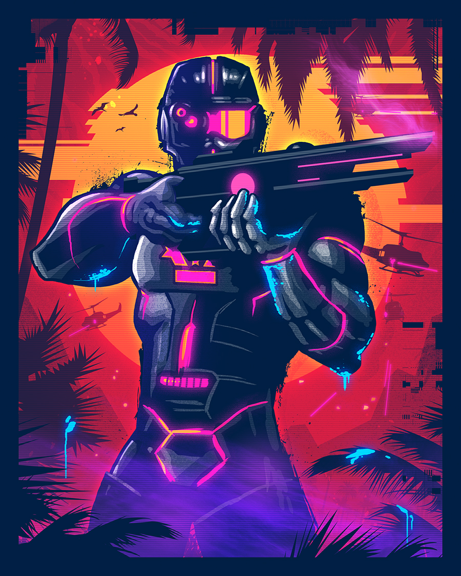
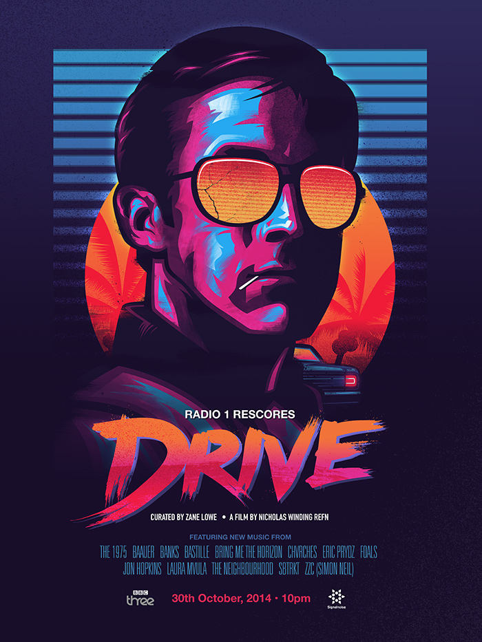
I think it’s all about visibility. I didn’t chase any of those companies to work with me, they reached out to work with me. Each job was unique in and of itself, but they all reached out because they saw my personal work online and wanted me to do that for their product, event, campaign or whatever. My art has a very specific vibe so when I work with those companies it’s typically a 1-off job. But Ubisoft was through my now buddy Dean Evans, upon a referral from my friend Jason Eisener (director of HOBO WITH A SHOTGUN). Dean is a creative director at Ubisoft. We got along instantly and shared all of the same love of the 80s. Far Cry 3: Blood Dragon was the greatest client job I’ve ever worked on, and appealed to everything I loved creating at the time. The work Dean and I did for the logo and box art remains a staple in the synthwave scene and is often imitated, which still blows me away.
You have worked hard for Ubisoft. Are you a nerd? If so, what are your favorite games?
Oddly, no. I’m not that big of a gamer these days. If I were to pick a few favourites of modern times I’d have to go with the Hotline Miami titles, Papers Please and The Long Dark… which are all incredibly different from one another. I don’t know, gaming is something I don’t have a lot of time for these days because when I’m not creating art, I’m goofing around with my Magic cards. I’m big into Magic: The Gathering because I like the social aspect of the game, and play weekly with my friends. I find video games a bit isolating. BUT, when I was a kid I was a huge Nintendo fan, and my favourite game to this day remains Bionic Commando for the NES.


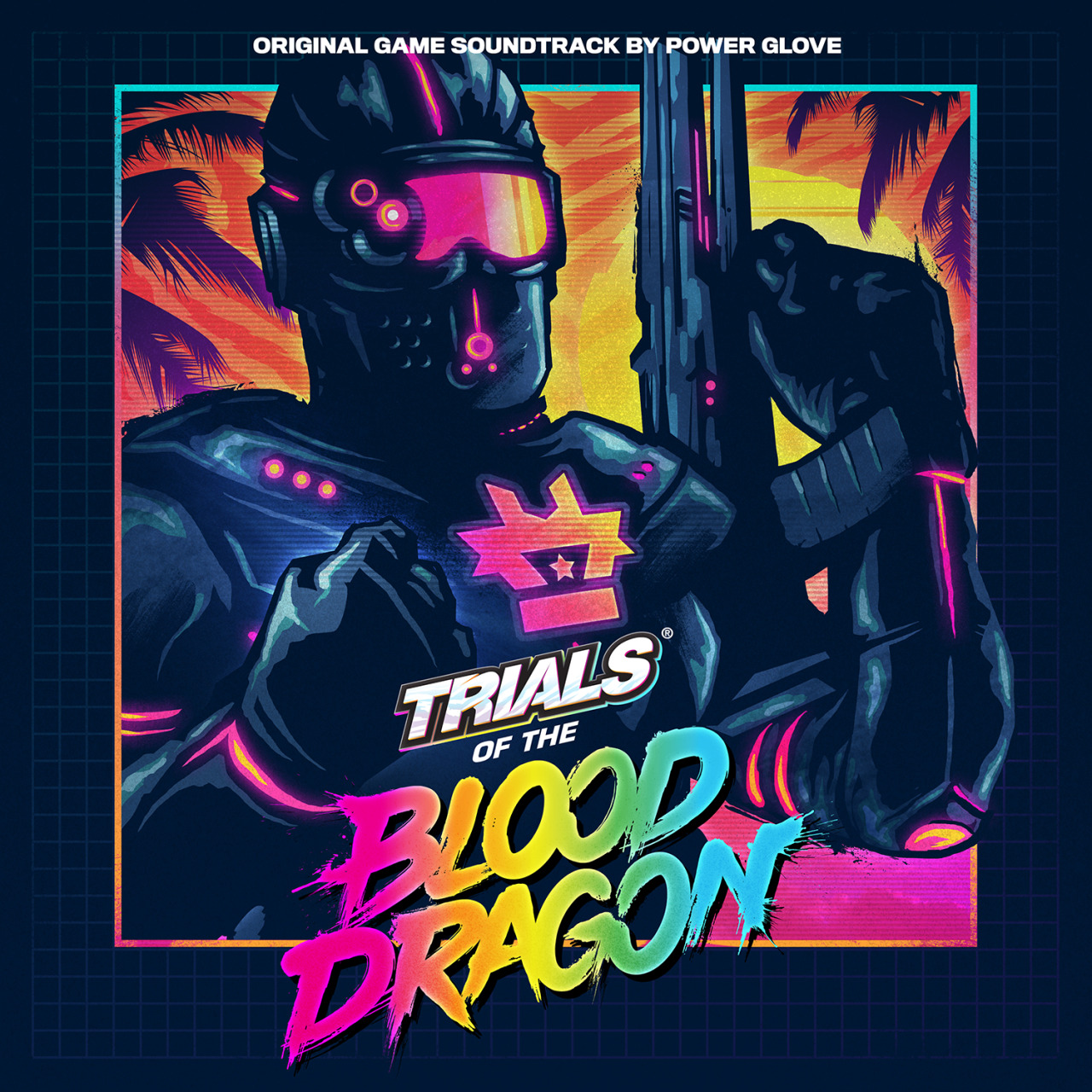
One of your works correspond to the album of the Australian brothers ‘Power Glove’, the soundtrack of the game ‘Trials of the Blood Dragon’ (also the soundtrack of Far Cry 3: Blood Dragon). What do you think about this genre inspired by the 80s? Do you have some favorite bands?
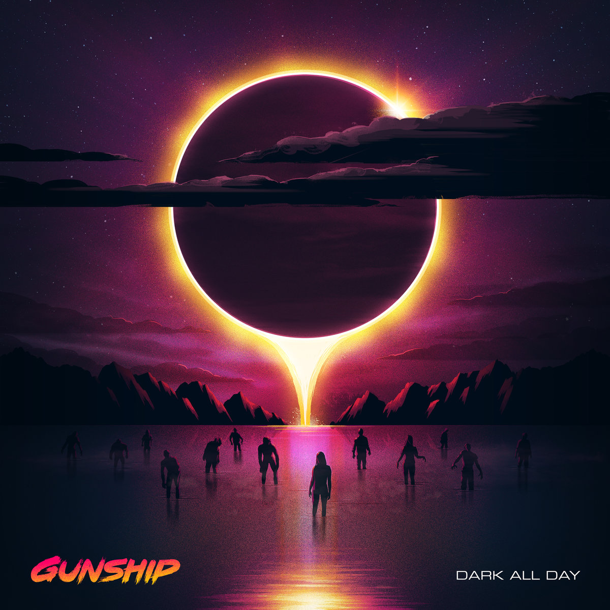
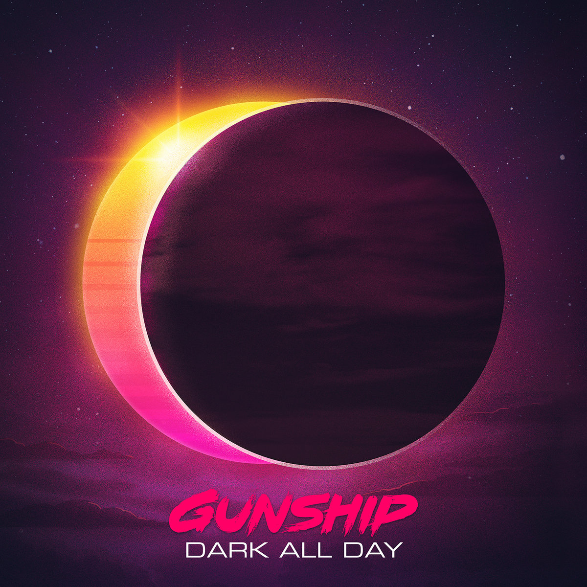
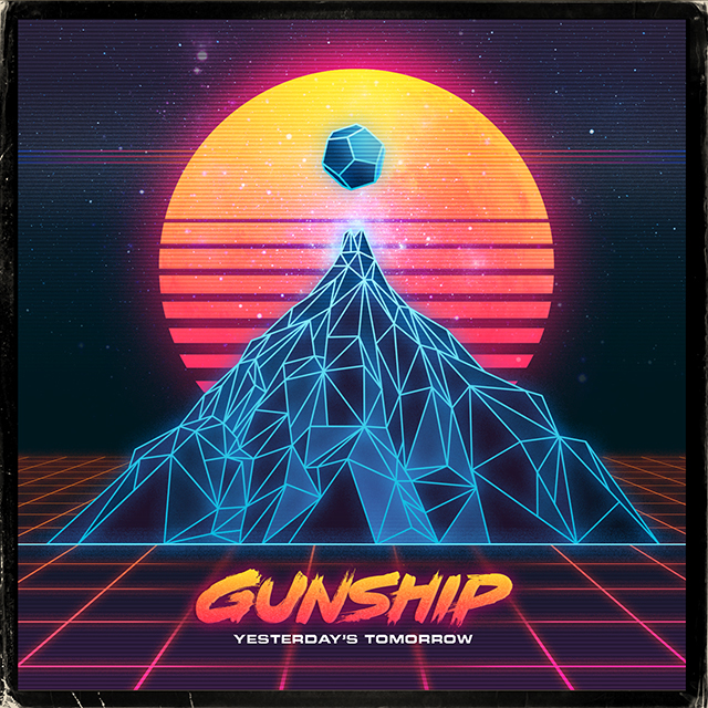
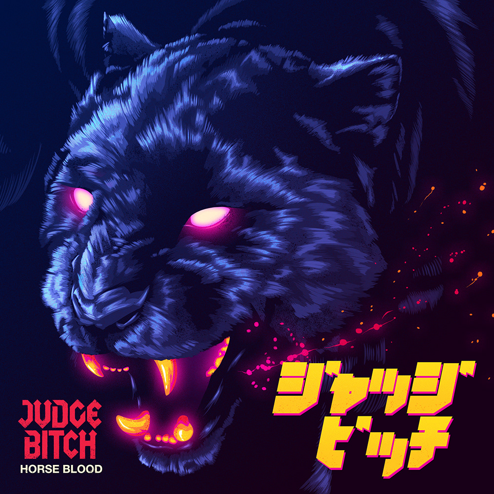
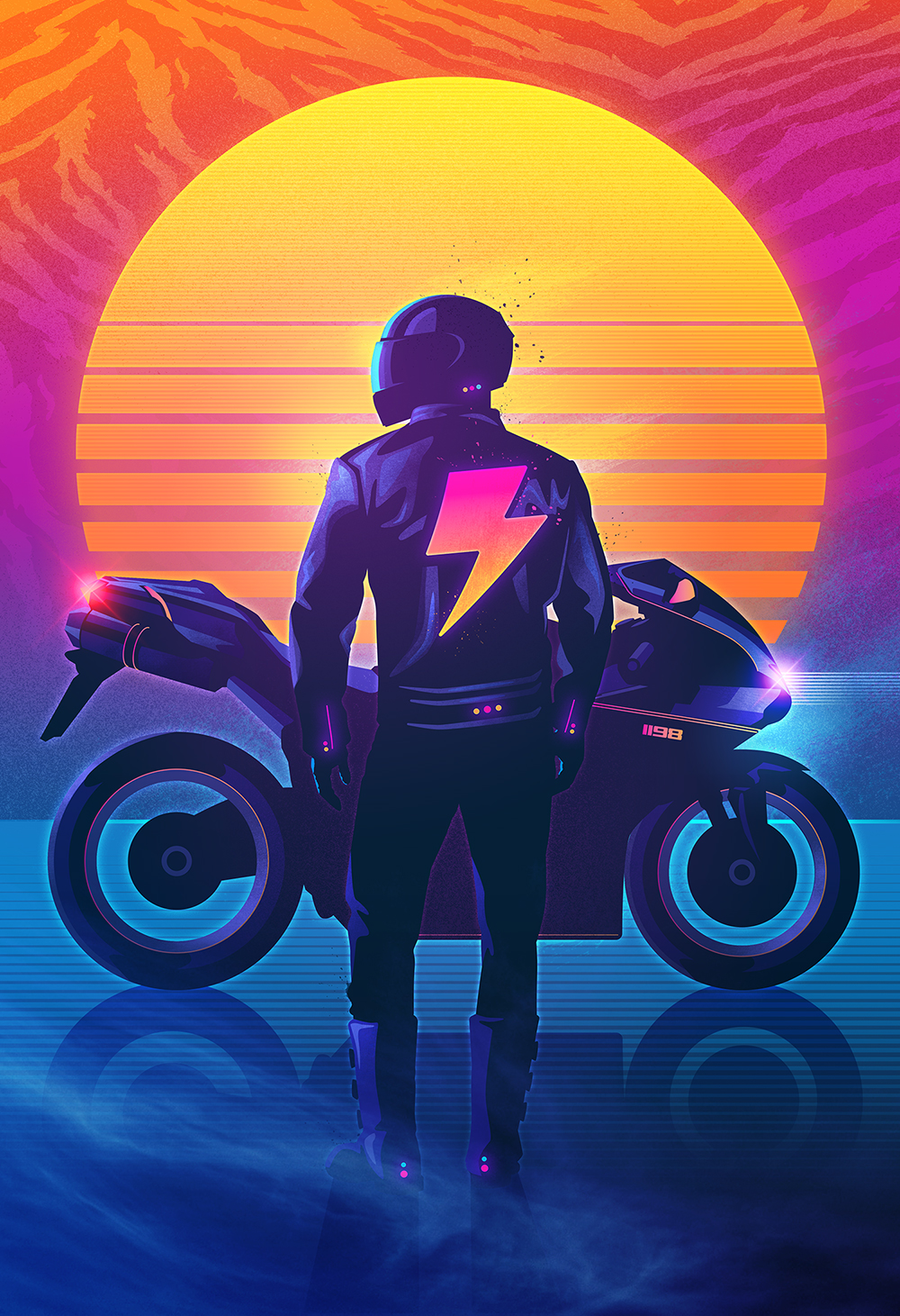
I absolutely love synthwave and outrun. I was introduced to the scene through my friend Jason Eisener (director of the film HOBO WITH A SHOTGUN) and instantly knew I wanted to be a part of it. I had already been familiar with Kavinsky thanks to the DRIVE soundtrack. The artwork I was doing at the time was influenced by the 80s, but after discovered this musical genre I actively started producing work influenced by what I was hearing. Carpenter Brut and Perturbator were among the first I heard, but my favourites list grew rapidly with the discovery of MegaDrive, Judge Bitch, Gunship, Dan Terminus, Dance with the Dead, FM-84 and many others.
Some of your influences come from your childhood toys amongst the Star Wars, Transformers, He-Man or GI Joe figurines as well as many other books. As you are for me, do you have, yourself, a master in the design world?
A huge inspiration from my childhood is definitely Masters of the Universe toy packaging and the awesome covers of Atari games. The artists behind those images were unsung heroes of mine when I was a kid, and their artwork got me so excited to own that toy or play that game. As I said, I was drawing at a very early age so I couldn’t understand how someone could get THAT good to draw a paint those incredible scenes and compositions. It fuelled my imagination, and still does to this day.


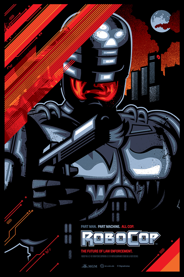
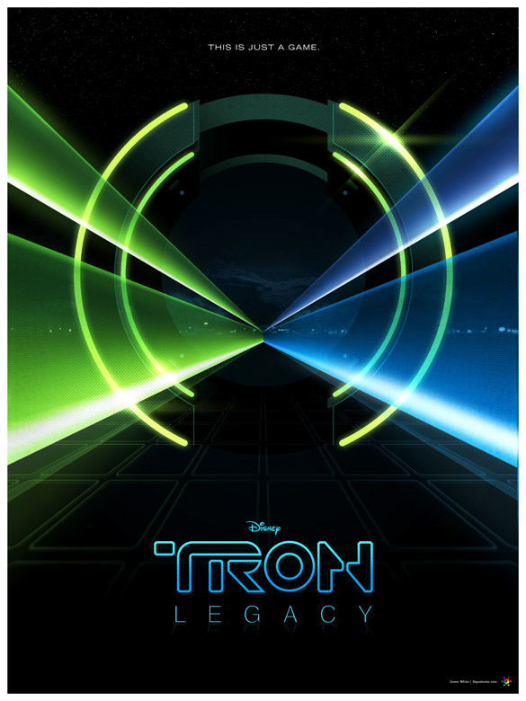
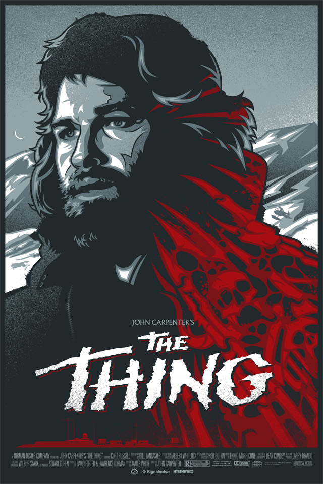
Some of your artworks are targeted to 80’s film posters (Robocop, Terminator, Back to the Future, The Thing, Tron …) reworked with your unique touch. Why did you choose to do this? What do you think about « Drive », « Kung Fury », « Stranger Things » and the video « Turbo Killer » (Carpenter Brut) by Seth Ickerman, the best representations of the 80s?
In 2001 I was trying to break into the alternative art movie poster scene, in hopes that people like Mondo would hire me to create official posters of my favourite films. I had some mild success, working with awesome people such as Skuzzles, Greymatter Art and Bottleneck Gallery. But ultimately, I decided to focus more on my own content and distanced myself from the pop-culture scene as it was becoming very polluted and overcrowded. I absolutely loved DRIVE, the movie still inspires me to this day. STRANGER THINGS was a breath of fresh air. For the last few years it seems people were more about making fun of the 80s rather than honouring it as an awesome time for pop-culture. Stranger Things treated that era with the upmost of respect and wasn’t heavy-handed about any of it’s influences. I loved that. And one of the things I like most about Carpenter Brut and Seth Ickerman’s work on TURBO KILLER is that they plucked references to the 80s but clearly did their own thing with it… which is a very difficult rope to walk. In doing so, they created an incredible piece of art which I’m sure will influence the entire scene.
Your retro-futuristic style is based on particular typographies with metal / Laser effects and a very bright colorimetry. Do you have any quick secrets to unveil about the creation of some artworks as resplendent as yours?
Honestly, not really. I don’t use any processes or effects that are difficult or complicated. You have to keep in mind, I’ve been making digital art since 1995 so I’ve become very comfortable with the tools I learned long ago and can make Photoshop and Illustrator do what I want. I’m not interested in any new technology Adobe puts into their software unless it directly aides what I do. I learned on Photoshop 2.0, back when EVERYTHING was difficult to do. I just never stopped experimenting with my tools, and I was conscious of not complicated my artistic process. Glows are easy to do, so I use them everywhere.
« I’ve been making digital art since 1995 so I’ve become very comfortable with the tools I learned long ago and can make Photoshop and Illustrator do what I want. »
Despite your many talents, you’re also a speaker. We didn’t have the chance to participate to one of your conferences about Photoshop and Illustrator. What has it brought to you in your career? Have you planned any conferences in 2017?
Yeah, I’ve been a professional speaker for 7 years, which has been an incredible journey. I’ve spoken at 65 events and have travelled all across the world. Speaking events allow me to connect directly with people whom I only know through Twitter and Instagram. I’ve met friends, colleagues and even my design heroes. It’s a great way to promote me and my work, but more importantly it allows me to encourage young designers and artists to keep pursuing their creative interests. We live in a world of constant change and negativity on top of an already oversaturated design industry. Sometimes we all need that extra nudge to keep moving forward to find our creative voice. Getting on stage is my way of cheering others on. We’re all in this together.

On what are you working now and what are your plans in the future?
At the moment I’m working on a variety of client jobs, all revolving around the synthwave style I’ve become known for. Which means, it’s all fun. I’ve wrapped up a wicked collaboration with Sam Todhunter and NewRetroWave on their latest Magnatron 2.0 album art, and also completed a puzzle design that should be launching soon. On top of that, I’m working on a BIG project that I’m not allowed to talk about yet. So that’s killing me. 🙂

Some words about our website and for our readers?
Thanks for reading and for supporting the synthwave scene! Our community seems to grow by the way and I’m always thrilled to meet likeminded people who love some neon pink, laser grids and some smooth chrome text. Stay rad!
A BIG thanks to James, the master, and Alex from The Mystery Box
Interview & Layout by Space Master
Supervised by Mikael Schutz
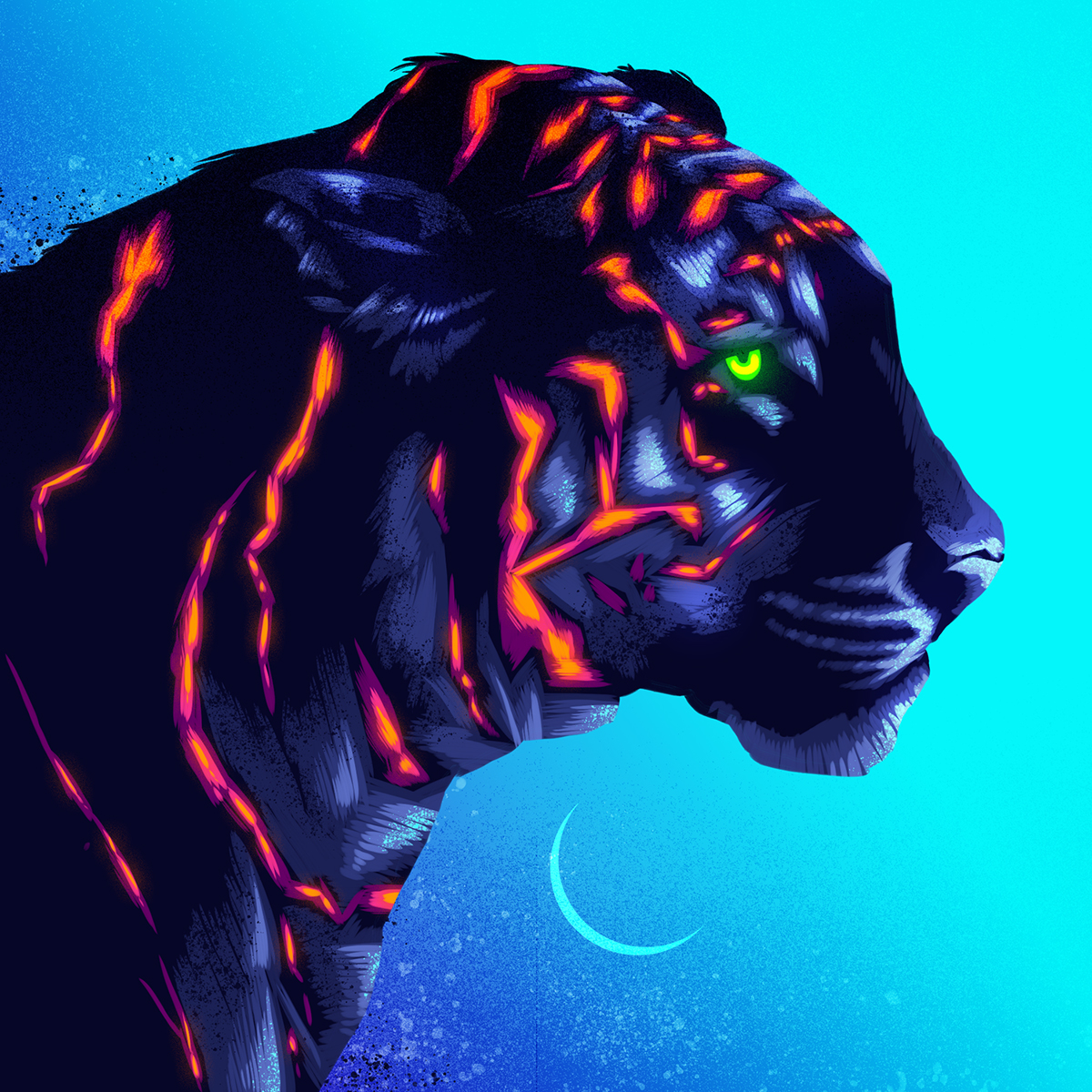
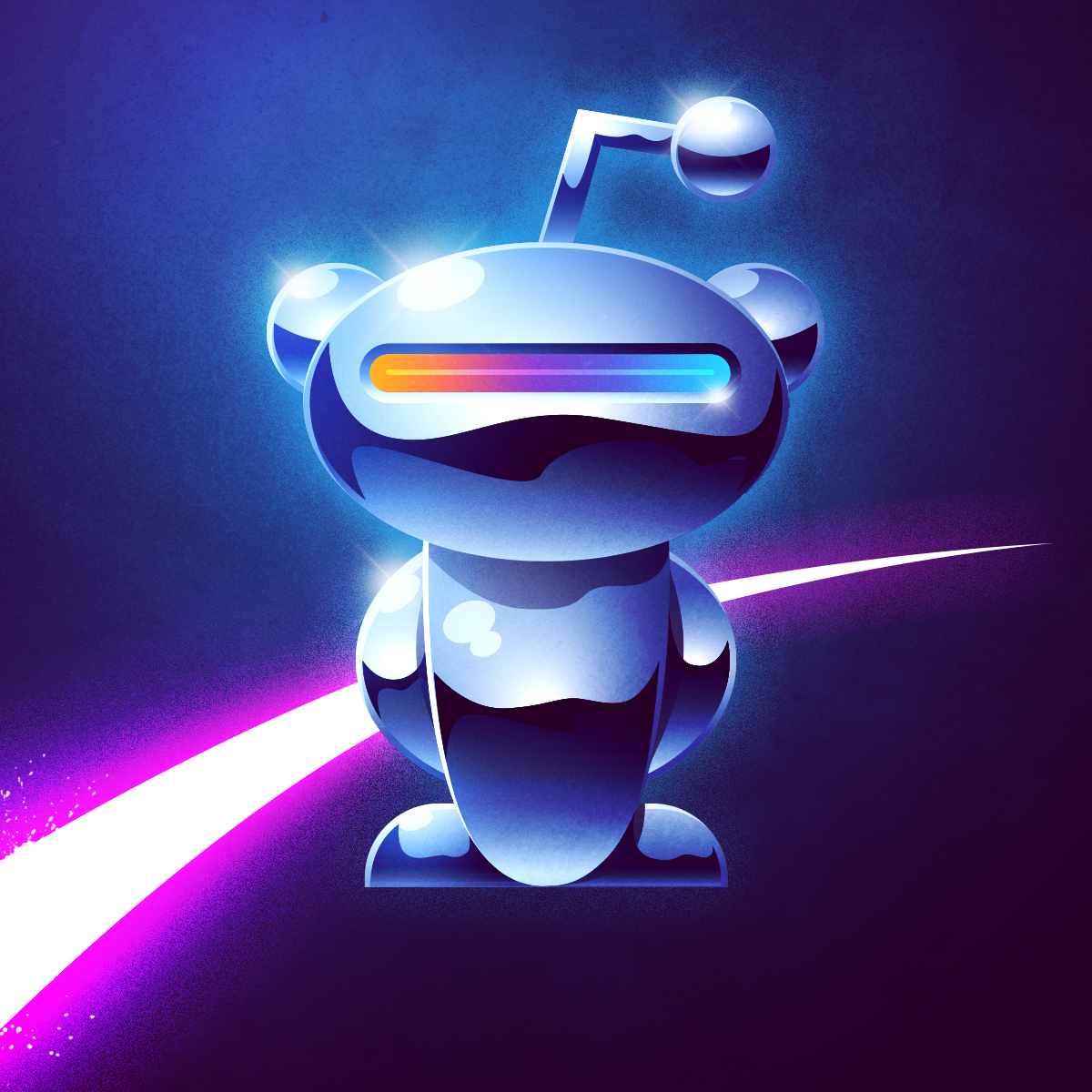
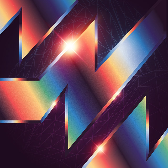
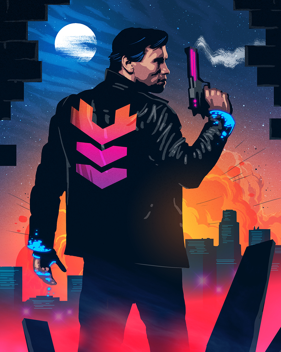
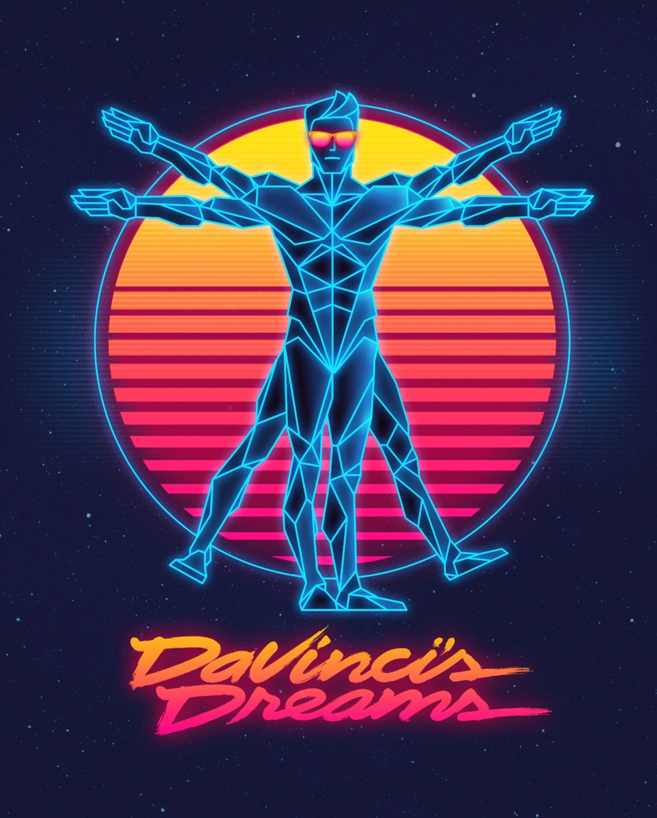
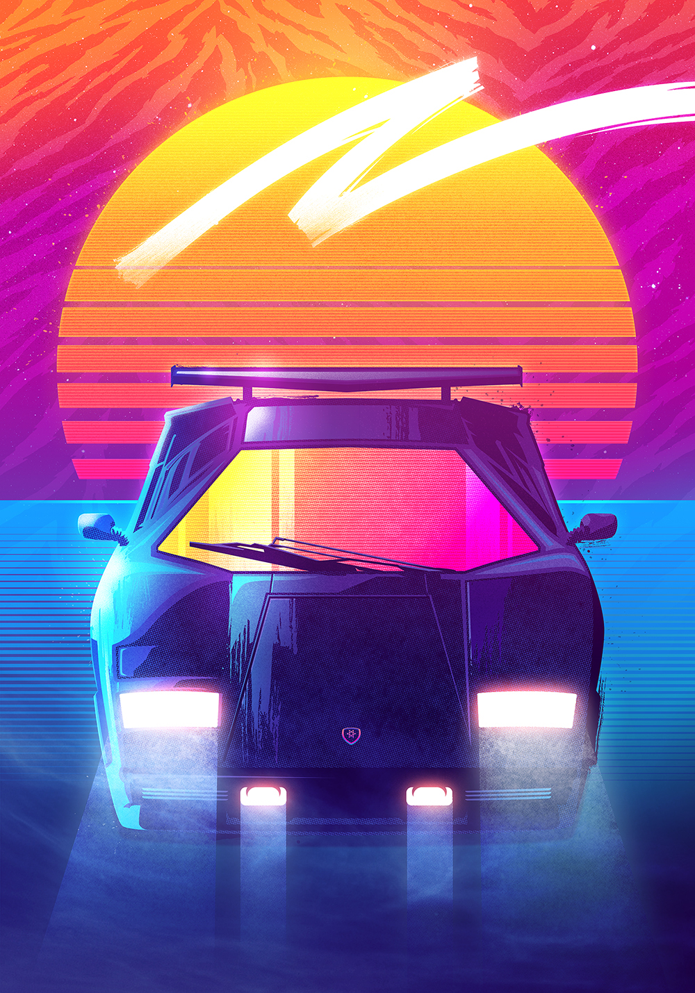
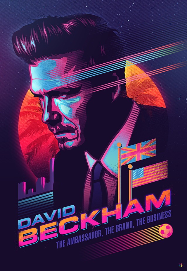
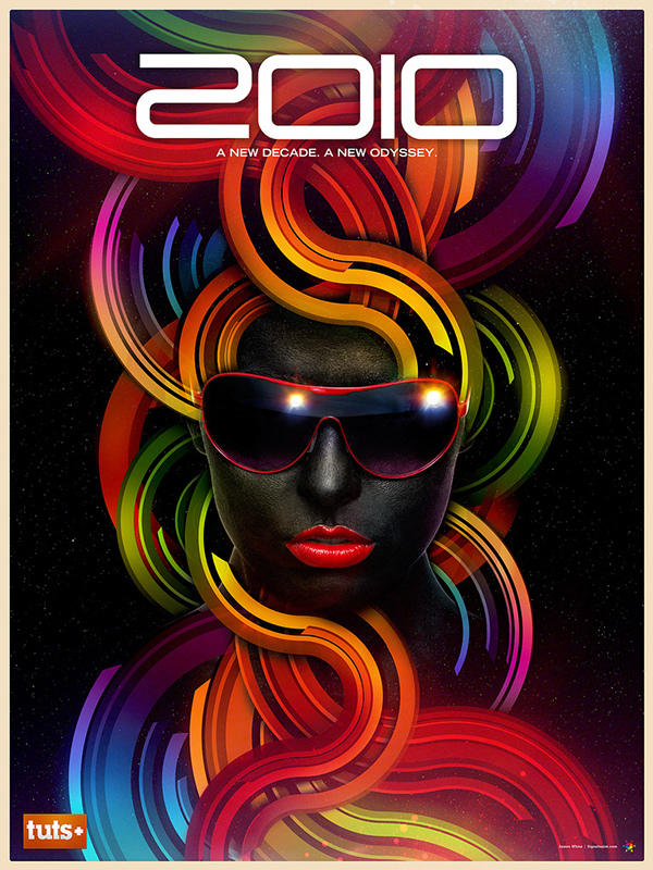
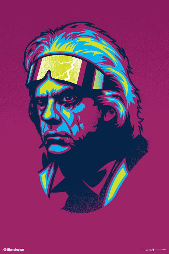
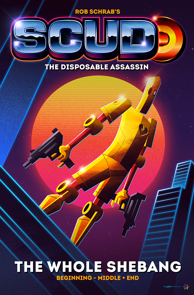
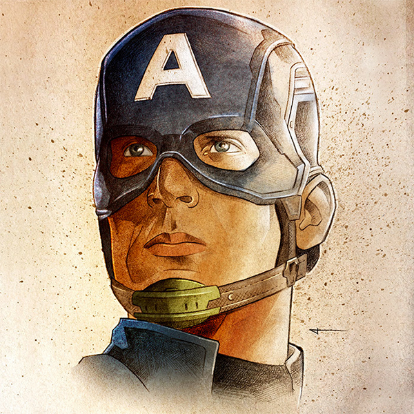
Artworks by James White


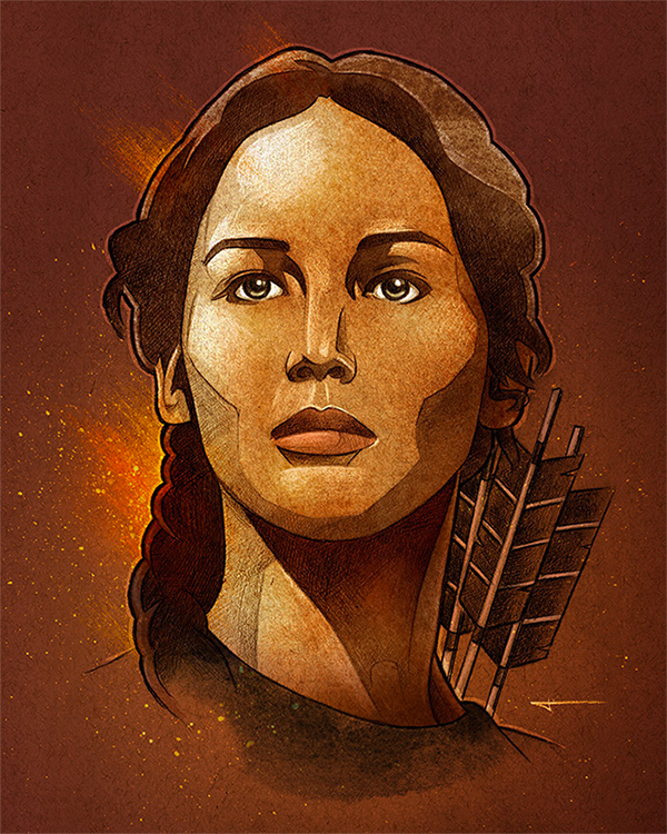
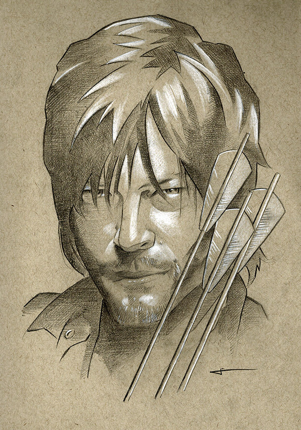
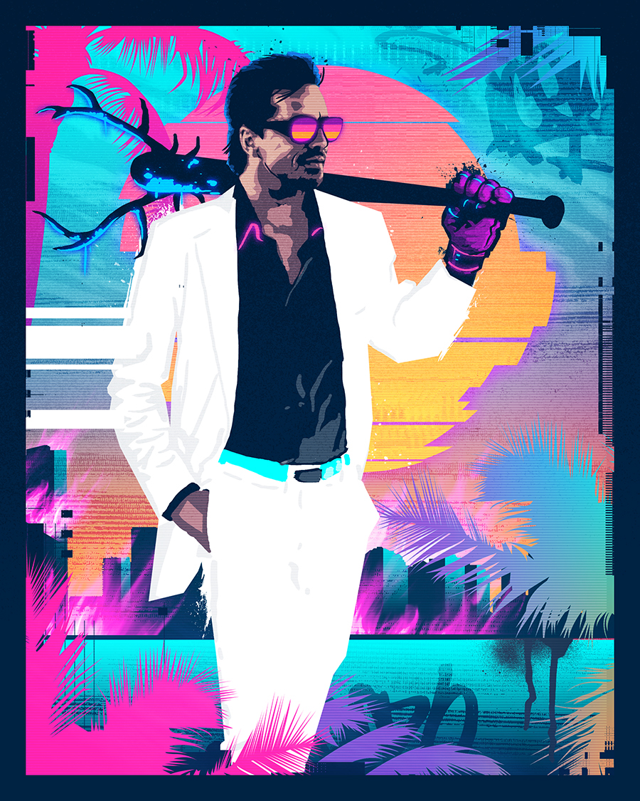
More artworks HERE